Manually inspecting data quality and cleaning data is a painful and time-consuming process that can take a huge chunk of a data scientist’s time on a project. According to a 2020 survey of data scientists conducted by Anaconda, data scientists spend approximately 66% of their time on data preparation and analysis tasks, including loading (19%), cleaning (26%), and visualizing data (21%). Amazon SageMaker offers a range of data preparation tools to meet different customer needs and preferences. For users who prefer a GUI-based interactive interface, SageMaker Data Wrangler offers 300+ built-in visualizations, analyses, and transformations to efficiently process data backed by Spark without writing a single line of code.
Data visualization in machine learning (ML) is an iterative process and requires continuous visualization of the dataset for discovery, investigation and validation. Putting data into perspective entails seeing each of the columns to comprehend possible data errors, missing values, wrong data types, misleading/incorrect data, outlier data, and more.
In this post, we’ll show you how Amazon SageMaker Data Wrangler automatically generates key visualizations of data distribution, detects data quality issues, and surfaces data insights such as outliers for each feature without writing a single line of code. It helps improve the data grid experience with automatic quality warnings (for example, missing values or invalid values). The automatically-generated visualizations are also interactive. For example, you can show a tabulation of the top five most frequent items ordered by percent, and hover over the bar to switch between count and percentage.
Prerequisites
Amazon SageMaker Data Wrangler is a SageMaker feature available within SageMaker Studio. You can follow the Studio onboarding process to spin up the Studio environment and notebooks. Although you can choose from a few authentication methods, the simplest way to create a Studio domain is to follow the Quick start instructions. The Quick start uses the same default settings as the standard Studio setup. You can also choose to onboard using AWS Identity and Access Management (IAM) Identity Center (successor to AWS Single Sign-On) for authentication (see Onboard to Amazon SageMaker Domain Using IAM Identity Center).
Solution Walkthrough
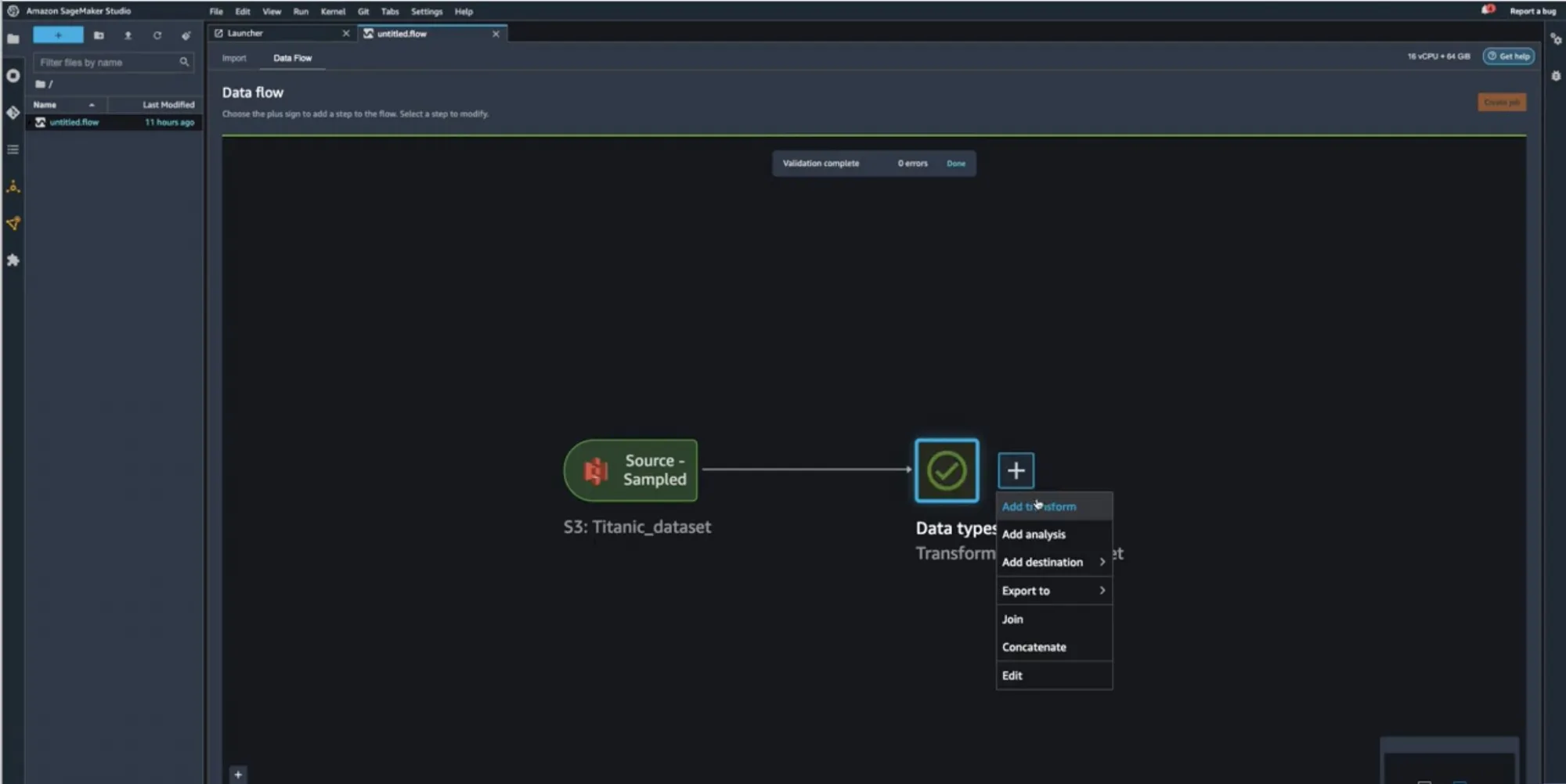
Start your SageMaker Studio Environment and create a new Data Wrangler flow. You can either import your own dataset or use a sample dataset (Titanic) as seen in the following image. These two nodes (the source node and the data type node) are clickable – when you double-click these two nodes, Data Wrangler will display the table.
In our case, let’s right-click on the Data Types icon and Add a transform:

You should now see visualizations on top of each column. Please allow for some time for the charts to load. The latency depends on the size of the dataset (for the Titanic dataset, it should take 1-2 seconds in the default instance).

Scroll to the horizontal top bar by hovering over tooltip. Now that the charts have loaded, you can see the data distribution, invalid values, and missing values. Outliers and missing values are characteristics of erroneous data, and it’s critical to identify them because they could affect your results. This means that because your data came from an unrepresentative sample, your findings may not be generalizable to situations outside of your study. Classification of values can be seen on the charts on the bottom where valid values are represented in white, invalid values in blue, and missing values in purple. You can also look at the outliers depicted by the blue dots to the left or right of a chart.

All the visualizations come in the form of histograms. For non-categorical data, a bucket set is defined for each bin. For categorical data, each unique value is treated as a bin. On top of the histogram, there’s a bar chart showing you the invalid and missing values. We can view the ratio of valid values for Numeric, Categorical, Binary, Text, and Datetime types, as well as the ratio of missing values based on the total null and empty cells and, finally, the ratio of invalid values. Let’s look at some examples to understand how you can see these using Data Wrangler’s pre-loaded sample Titanic Dataset.
Example 1 – We can look at the 20% missing values for the AGE feature/column. It’s crucial to deal with missing data in the field of data-related research/ML, either by removing it or imputing it (handling the missing values with some estimation).

You can process missing values using the Handle missing values transform group. Use the Impute missing transform to generate imputed values where missing values were found in input column. The configuration depends on your data type.
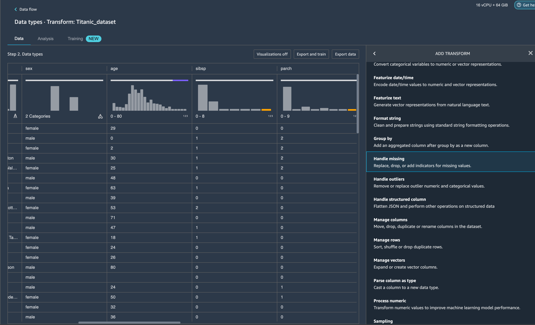
In this example, the AGE column has numeric data type. For imputing strategy, we can choose to impute the mean or the approximate median over the values that are present in your dataset.

Now that we have added the transformation, we can see that the AGE column no longer has missing values.

Example 2 – We can look at the 27% invalid values for the TICKET feature/column which is of the STRING type. Invalid data can produce biased estimates, which can reduce a model’s accuracy and result in false conclusions. Let us explore some transforms that we can utilize to handle the invalid data in the TICKET column.

Looking at the screenshot, we see that some of the inputs are written in a format that contains alphabets before numerals “PC 17318” and others are just numerals such as “11769”.
We can choose to apply a transform to search for and edit specific patterns within strings such as “PC” and replace them. Next, we can cast our string column to a new type such as Long for ease of use.


This still leaves us with 19% missing values on the TICKET feature. Similar to example 1, we can now impute the missing values using mean or approximate median. The feature TICKET should no longer have invalid or missing values as per the image below.

Clean Up
To make sure that you don’t incur charges after following this tutorial, make sure that you shut down the Data Wrangler app.
Conclusion
In this post, we presented the new Amazon Sagemaker Data Wrangler widget that will help remove the undifferentiated heavy lifting for end users during data preparation with automatically surfacing visualizations and data profiling insights for each feature. This widget makes it easy to visualize data (for example, categorical/non-categorical histogram), detect data quality issues (for example, missing values and invalid values), and surface data insights (for example, outliers and top N item).
You can start using this capability today in all of the regions where SageMaker Studio is available. Give it a try, and let us know what you think. We’re always looking forward to your feedback, either through your usual AWS support contacts, or on the AWS Forum for SageMaker.
About the Authors
 Isha Dua is a Senior Solutions Architect based in the San Francisco Bay Area. She helps AWS Enterprise customers grow by understanding their goals and challenges, and guides them on how they can architect their applications in a cloud-native manner while making sure they are resilient and scalable. She’s passionate about machine learning technologies and environmental sustainability.
 Parth Patel is a Solutions Architect at AWS in the San Francisco Bay Area. Parth guides customers to accelerate their journey to the cloud and helps them adopt the AWS Cloud successfully. He focuses on ML and application modernization.